Unifying Morgan Stanley’s Knowledge in a Documentation Platform
Morgan Stanley’s internal documentation tools and resources existed across disparate systems and locations, making it challenging for employees to find the guidance they needed. Teams couldn’t verify which documents were current, wasting hours hunting for procedures across platforms. This information chaos threatened accuracy and productivity.
Morgan Stanley needed a unified knowledge platform that would make critical information findable, verifiable, and trustworthy.
My Role
Creative Director & Lead UI Designer - Co-led UX strategy and UI design alongside a product manager and UX/content strategist.
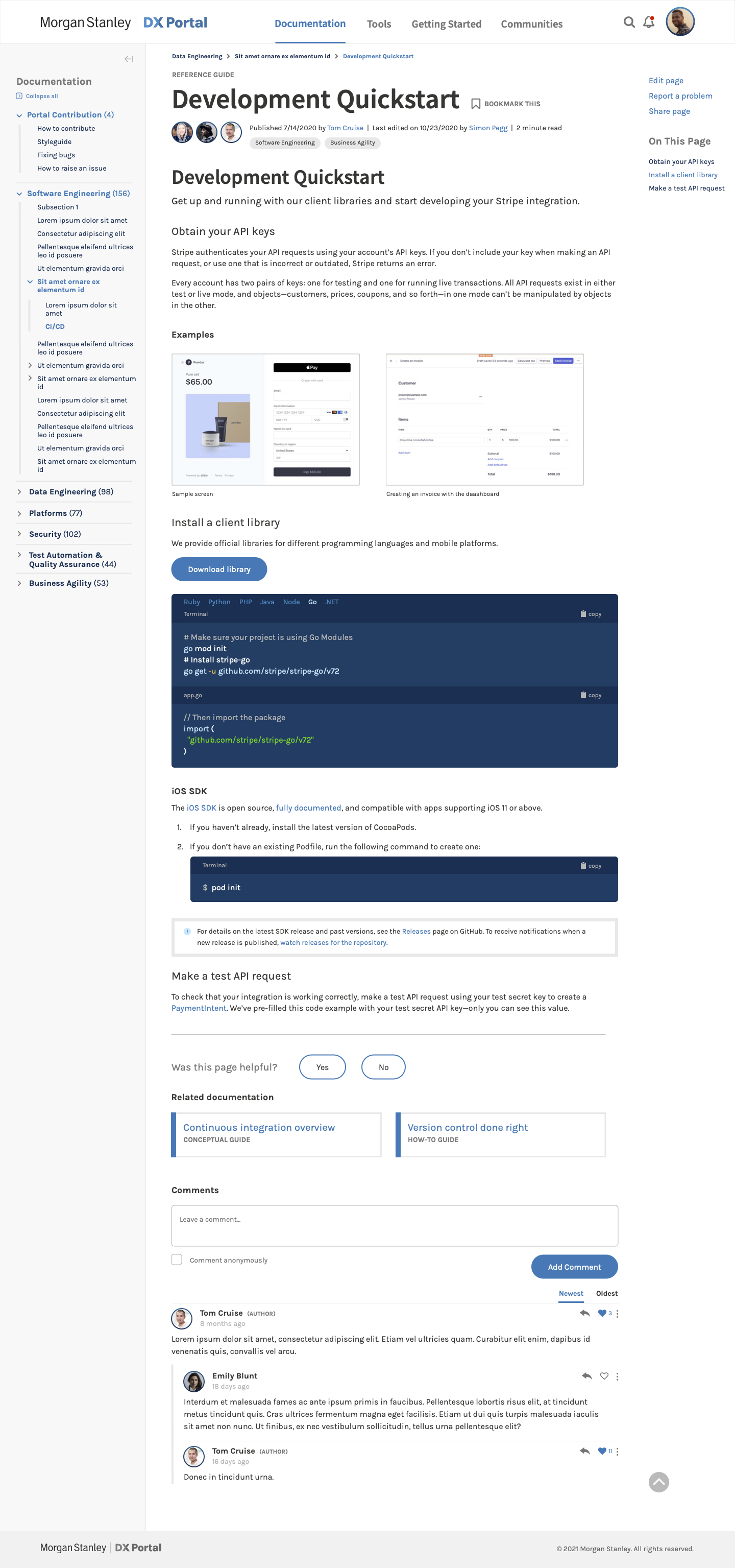
Contributions - Drawing on interviews with 20+ employees and legacy system analysis, I shaped the information architecture around user tasks and roles. I designed 17 screen templates, a comprehensive component library, and the full branded visual language including iconography and illustration patterns. I delivered high-fidelity prototypes ready for handoff.
I translated a fragmented, multi-system documentation landscape into a unified portal that became the primary information entryway for 5,000+ Morgan Stanley employees — grounded in how people actually work.
The Challenge
An overabundance of documentation existed across disparate systems with no clear organization, making it difficult for employees to find what they needed—especially when they didn’t know exactly what to search for.
Key Problems
- Employees had to know which system contained the information they needed before searching
- Search terms and patterns varied across systems, making a universal search impossible
- Documentation spread across multiple platforms resulted in duplication, outdated information, and conflicting details
- No clear indicators of document currency or authority
- Mobile access was inconsistent or non-existent
Business Impact
- Employees spent excessive time searching and verifying information instead of productive work
- Higher risk of compliance issues due to outdated or conflicting documentation
- No single source of truth across the organization
- High costs of maintaining multiple legacy platforms
- Decreased productivity during critical operational periods
The Goal
Design a unified knowledge portal that consolidates all documentation into a single, searchable platform organized around user tasks and workflows—improving findability while reducing technical debt and compliance risk.
The Approach
Discovery & Research Phase
Methods
- Interviewed 20+ employees and stakeholders across departments
- Analyzed legacy systems’ content structure and organization
- Examined search logs and query patterns
- Conducted card sorting to understand mental models for categorization
- Competitive analysis of modern knowledge portals
Key Problems
- There was no clear consistency in using different systems, making the user experience worse
- The systems were not always mobile-friendly
- Different search patterns were needed for optimal results in different documentation systems
Insights
Employees organized their work around tasks and outcomes (“I need to onboard a client” or “I need compliance documentation for an audit”), not system names or departmental ownership. The portal needed to match this mental model, organizing content by job-to-be-done rather than legacy system structure.
Design & Information Architecture
Information Architecture and Content Strategy
- Create a unified taxonomy based on user mental models and tasks, not legacy system structure.
- Mapped all content types from legacy systems
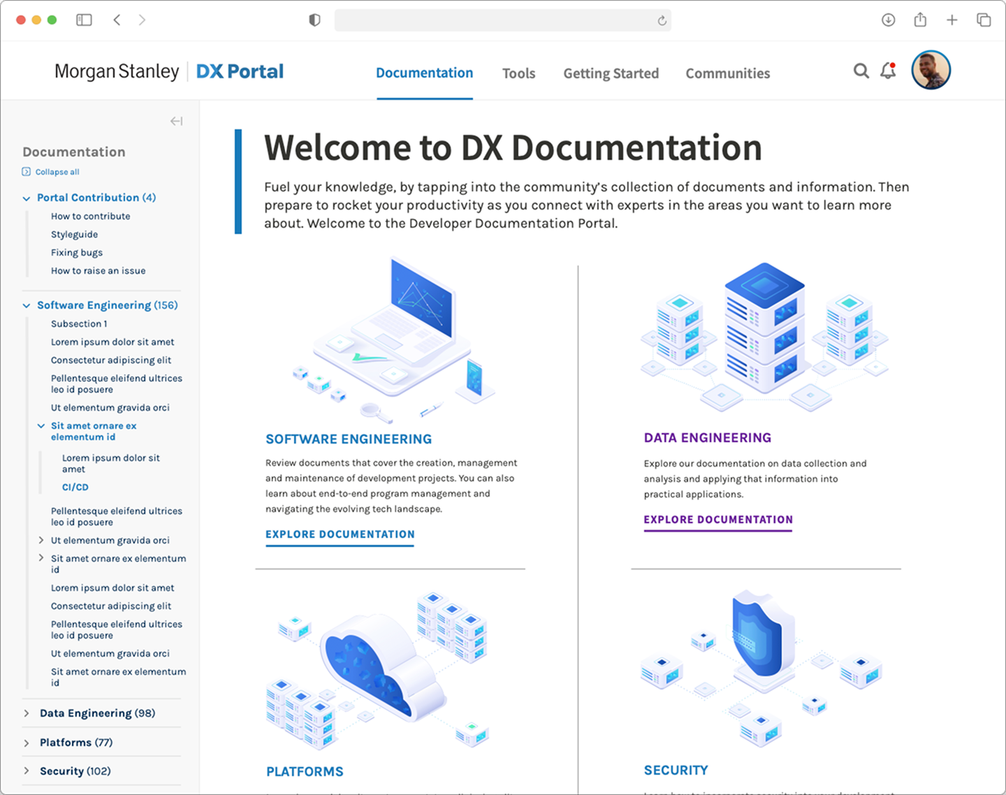
- Consolidated multiple taxonomies into a unified structure organized by:
- User roles (Engineering, Compliance, Operations, Sales)
- Task types (Onboarding, Reporting, Troubleshooting)
- Content types (Policy, Procedure, Guide, Tool)
- Implemented a tagging system enabling content to appear in multiple categories without duplication
- Established metadata requirements: owner, last updated, approval status, related content
The Result
- Documentation consolidated and organized by task-based categories
- Flexible tagging system allowing content to relate to multiple categories
- Connected content guiding users to related resources
- Clear metadata, ensuring document currency and authority
- Single source of truth across all documentation types
Visual Design and UI
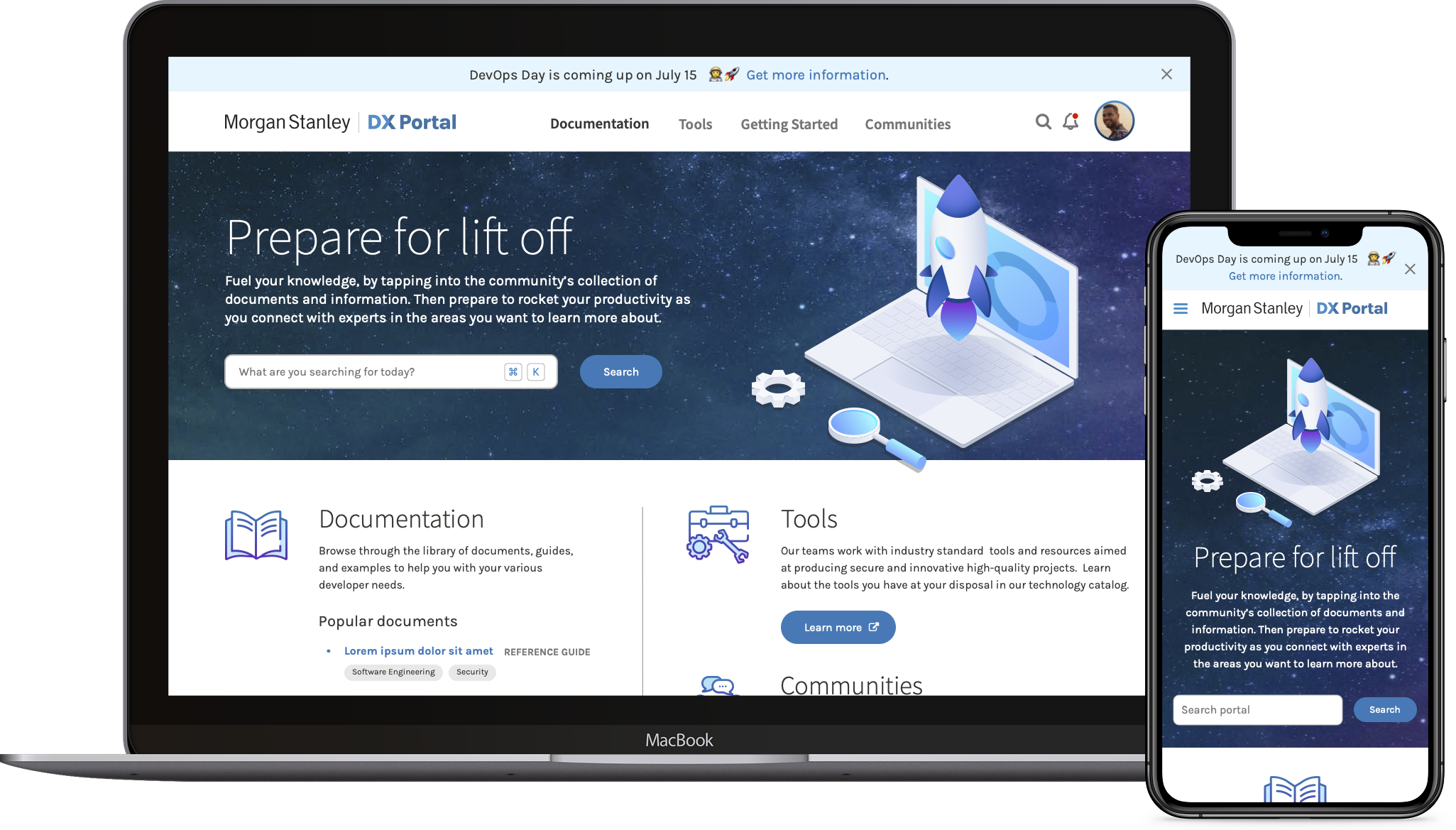
Led visual design creating a modern, intuitive interface that balanced powerful search capabilities with simple navigation.
Activities
- Created wireframes aligned with user flows and documentation best practices
- Designed 17-page templates demonstrating consistent content hierarchy
- Built a comprehensive component library for diverse content types
- Developed brand color palette, iconography, and illustration patterns
Design Principles
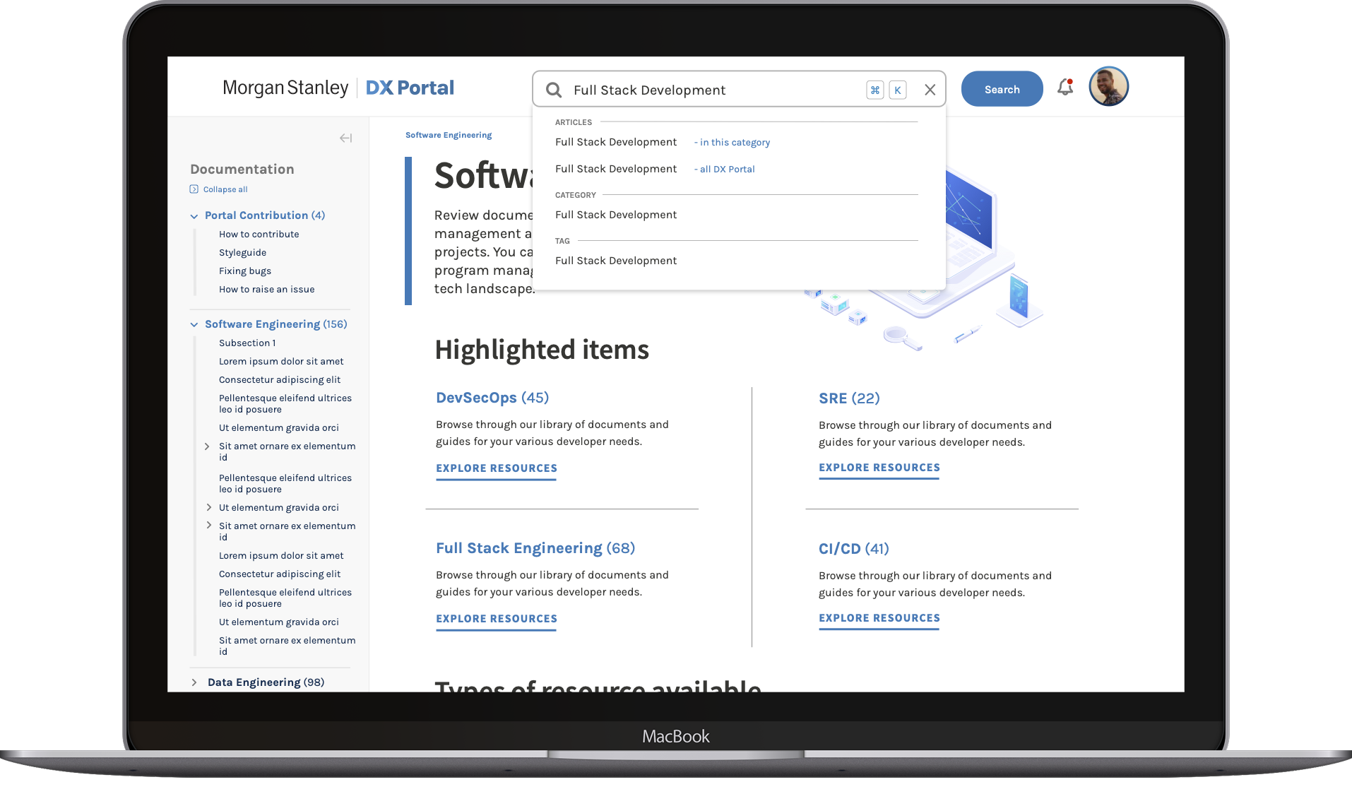
- Search-First Interface: Prominent search bar with intelligent auto-suggestions based on popular queries and synonyms, remembering user patterns to suggest relevant content.
- Contextual Help: Inline guidance for complex searches (“Looking for compliance docs? Try filtering by ‘Needs Approval’ status”).
- Mobile-Accessible: Fully responsive design enabling field staff to access procedures and forms on mobile devices.
- Trust Signals: Clear indicators for document status, last-updated dates, and content owners to build confidence in information accuracy.
The Result
- Modern interface balancing powerful search with simple navigation
- Modular card-based layout for different content types (policies, forms, updates)
- Clear visual hierarchy guiding users to the most relevant information first
- Smart filters allowing multi-faceted search (by role + content type + date range)
- Mobile-optimized interface enabling field access to critical documents
- Version history and approval status visible at a glance
Morgan Stanley’s employees weren’t a monolithic user base—ranging from technical experts who knew exactly what they needed, to new hires unsure about where to start. The unified platform needed to eliminate the chaos of multiple systems while respecting these vastly different proficiency levels and use cases.
This was achieved through layered complexity: sophisticated search and filters for power users, while contextual help and community features supported those learning the system. The platform unified the experience without forcing uniformity on its users.
The Impact
This project required more than UI design skills—it needed someone who could translate complex, fragmented systems into a cohesive user experience grounded in how people actually work.
My research-driven approach prevented the common mistake of simply replicating legacy structure in a new interface. By understanding how employees actually organized their tasks, I designed an information architecture that matched real workflows rather than outdated system logic.
When the unified taxonomy threatened to become overwhelming in the interface, I simplified it through flexible tag-based navigation—making complexity manageable without sacrificing depth. And through strategic design of search features—type-ahead results, contextual filters, smart suggestions—I transformed the portal from merely usable into genuinely helpful, serving as the primary entryway for 5,000+ employees’ daily documentation needs.
The result was a fundamental transformation in how Morgan Stanley accessed critical knowledge, enabling the organization to operate as a unified entity rather than disconnected departments struggling to share information.