Selling destinations through storytelling
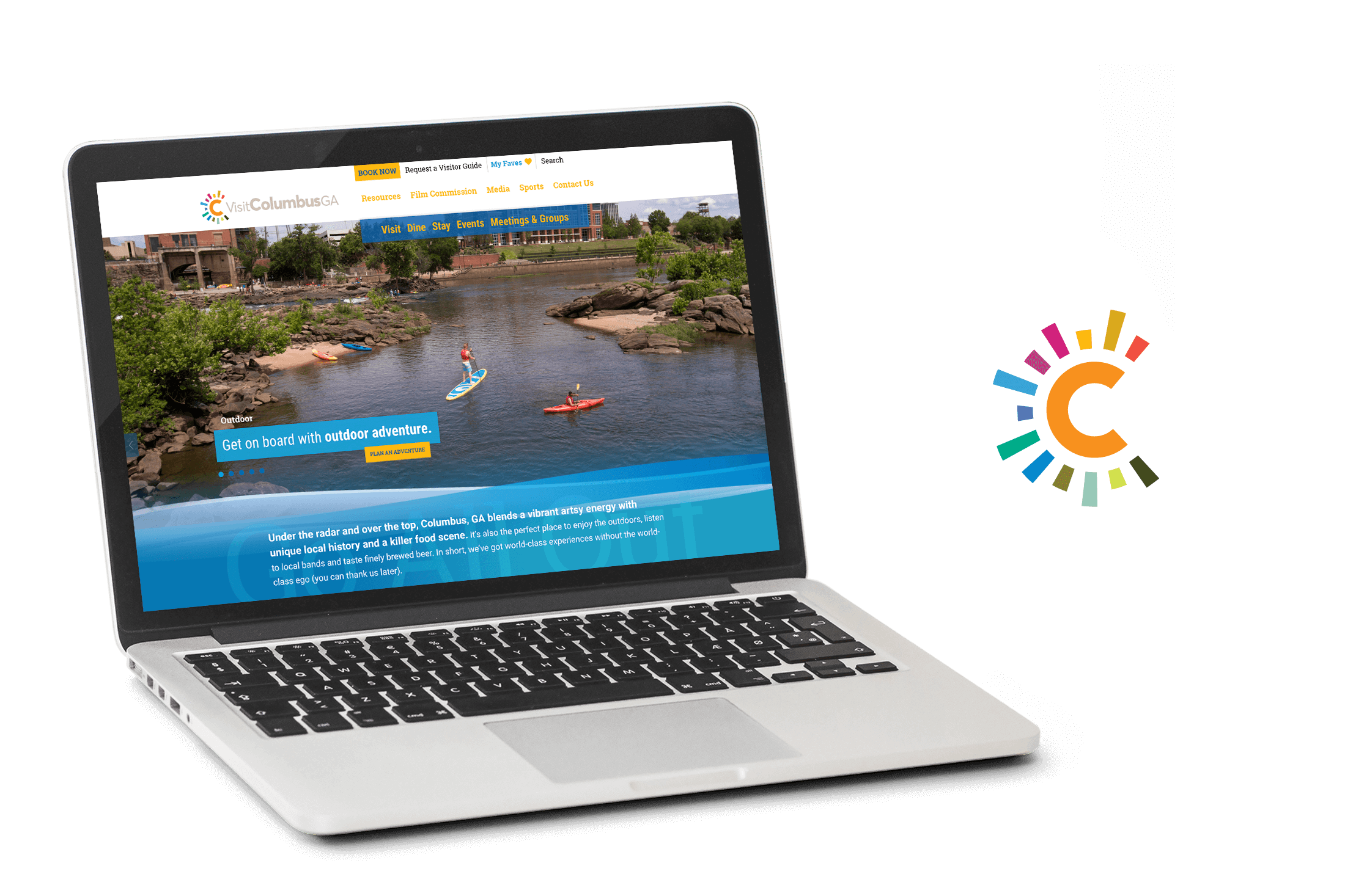
The Columbus, Georgia CVB (a Destination Marketing Organization) needed to update their website. The agency I worked for, Stamp, has worked with this organization for many years and through several iterations of their website. From the start, our team knew we were aiming for a product that was more than just a change in visual flair–we wanted to provide the client with a new method of communicating with prospective visitors as well as a roadmap for longevity. To keep it interesting, the DMO was also in the process of rebranding itself.
Research and planning
After reviewing the research, the marketing action plan, the existing website analytics, and information gathered from our initial client meeting, I urged our team to break from our standard compartmentalized planning approach and pursue a few collaboration sessions. This resulted in the creation of a handful of documents that became the roadmap to our website redesign.
A wealth of information
The client was already armed with a visitor study commissioned from a research group. Our company had also worked with the CVB to develop what we have dubbed a marketing action plan (MAP) to help define the organization’s target markets, target needs and actionable items to reach each persona.
Guided by research
The first document outlined the client’s desired goals, terms of measurement and also listed the hierarchy of importance among the goals. The second document included the results of our research across like-sized DMO websites as well as known technological trends that would benefit our client. The final document merged the two together resulting in a listing of proposed technology/presentation changes, where they could come into play on the website, and the hierarchy of their importance. Through the presentation of these documents and discussion with our client, we finally had the information needed to begin the wireframes.
Wireframing
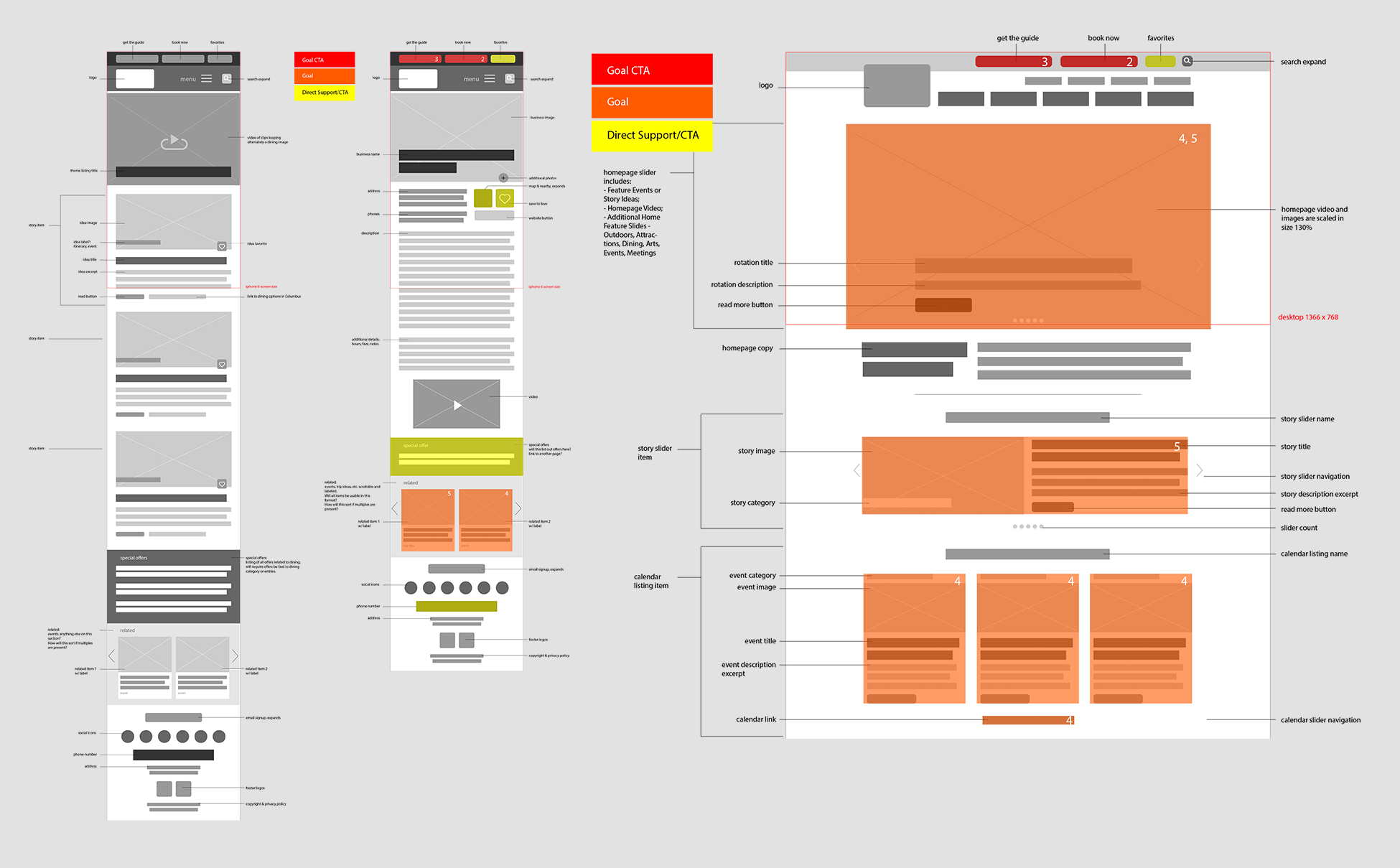
Employing our mobile-first approach, I led our team in efforts to plot out the user interface. Our wireframing step also included primary calls to action (CTAs), informational goals as well as content that supported either. This helped our team adjust content organization and showed us where we could afford an additional link to guide visitors closer to some form of contact.
Staying the course
As with all destination marketing websites, you have to juggle the want and need to present a plethora of information. But in abiding by our documents that clearly defined our objectives and priorities, we were able to efficiently make layout decisions and solve the obstacles we foresaw and produce a leaner mobile experience. This included expandable windows for secondary information and the creation of interactions that didn’t detract from the typical user experience. Our desktop wireframes expanded upon the mobile information and aided us in defining specifications such as optimal viewing for the increase in video and higher definition photos we were incorporating.
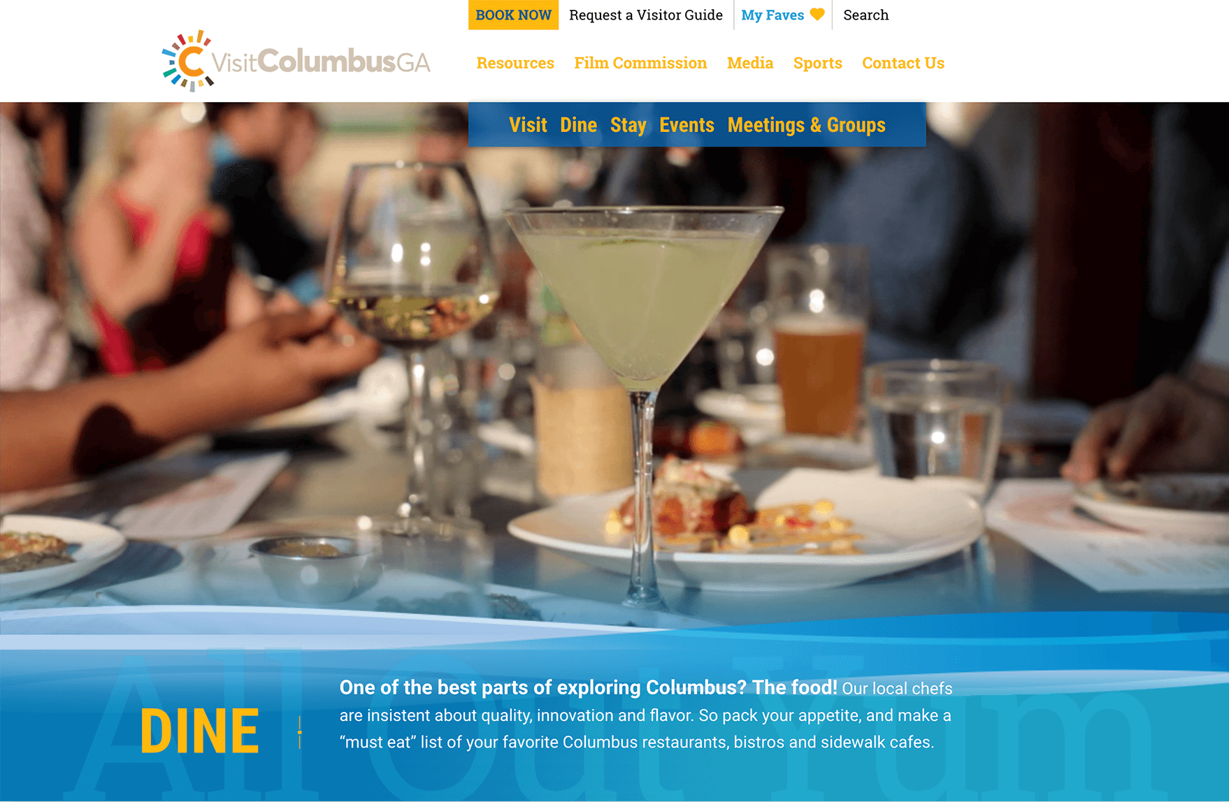
The design
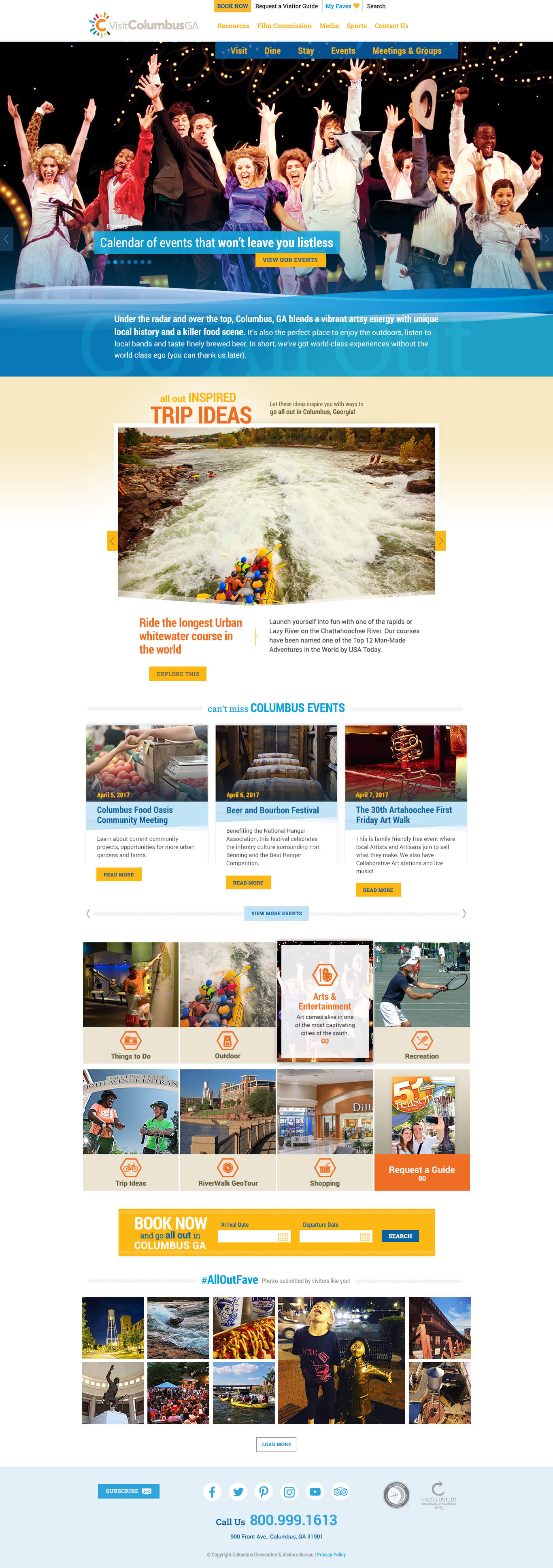
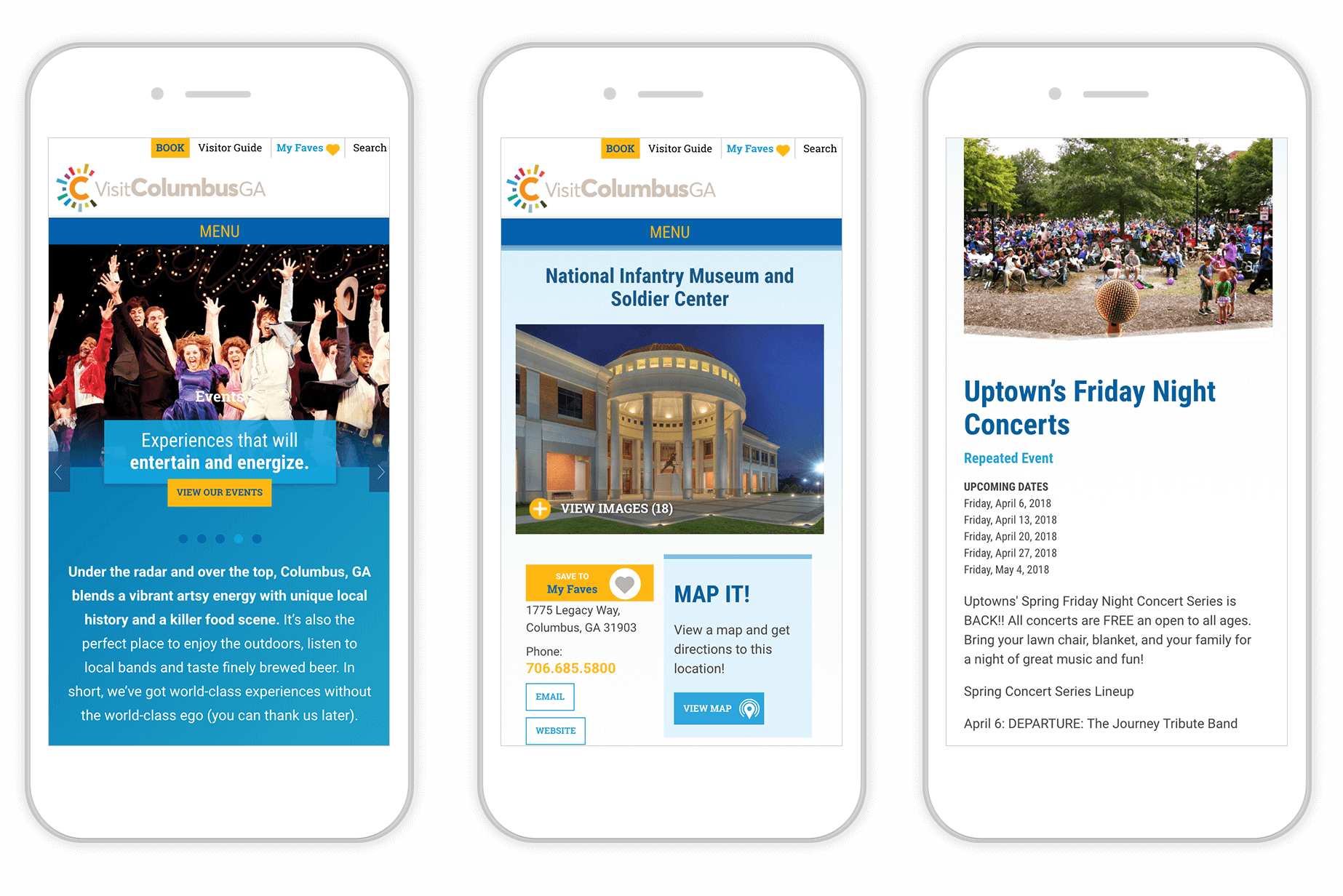
Breaking from the previous solution of having a mobile-optimized site, Stamp made it a priority to develop a mobile-responsive site during the update. Following a process of designing the deepest, text-heavy pages up to the landing and home pages, we were able to develop a design system that iteratively layered on visual elements, building an almost natural hierarchy of content. All of this yielded a more cohesive cross-platform visitor experience.
Content with a purpose
Keeping content fresh and relevant was the crux of our content strategy for the new website. To achieve this, we needed to define what the sources of information would be and how to keep visual familiarity for the content as it would be shared/re-purposed throughout the website.
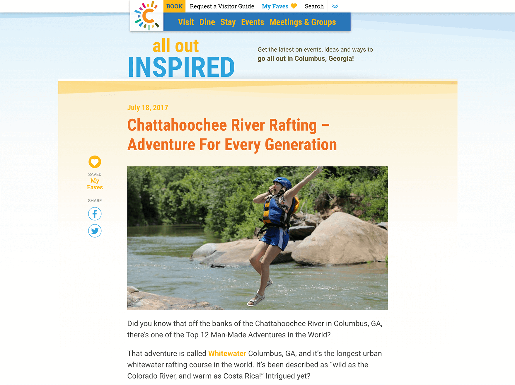
The first source we defined was the calendar of events. This section of the site was already built up and steadily growing, as it had become a community calendar among the client’s partners. The second, and larger source of information would be a repurposed blog. With the content strategy for this client involving immersive storytelling, we felt ‘Experiences’ was a more appropriate label.
The development
To coincide with this update in look and functionality, we were also upgrading the CMS and overhauling the template system to do away with years of past-prime coding and content. Coupling this aspect with our previously mentioned design system, we were able to produce a much leaner coded website resulting in faster load times.
Images and content are copyright by Visit Columbus, GA.